
 The minimalist design is a trend in this 2014, almost all people have a notion of this concept, however this type of design is particularly suitable for commercial establishments Why? Let us give the main reasons:
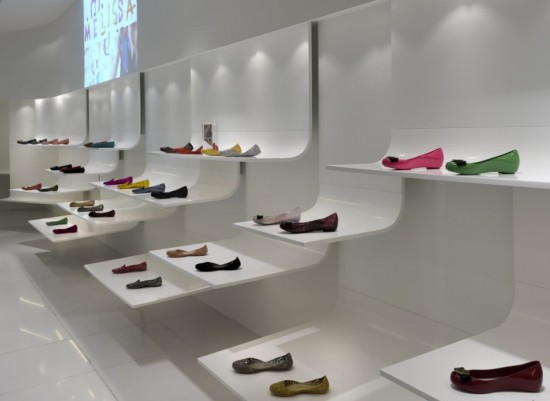
– Broad zones: The minimalist design allows the existence of large spaces where customers can move closer to the products and freely. This is an advantage in granting the possibility to visualize the layout of the store quickly, eliminating the dreaded “cold zones”.
– Sober colors: The minimalist design is characterized by using a range of colors together, without appealing to the contrasts. This sobriety is ensuring the product get the real importance, inviting consumers to enter, look and buy.
– Focus on the physical and visual reduction: This is to reduce the space to a number of basic elements that are then combined to create different atmospheres in each store. These spaces provide amplitude, neatness , lightness, and a comfortable atmosphere for sale.
– Geometric Shapes: Allow you to create all kinds of patterns and geometric designs in isometric perspective, providing accuracy to spaces. These forms are particularly important to emphasize the contour and volumes of the products displayed and give them a character to shine.
We hope that these reasons have convinced you use the minimalist design in your store settings. Remember if you need any tips or advice on materials, colors, shapes and lighting you can contact us on the “contact” section of this website.